UI Design system & styleguide
New feature / Rework
This project was done during my time at ExB.
Introduction
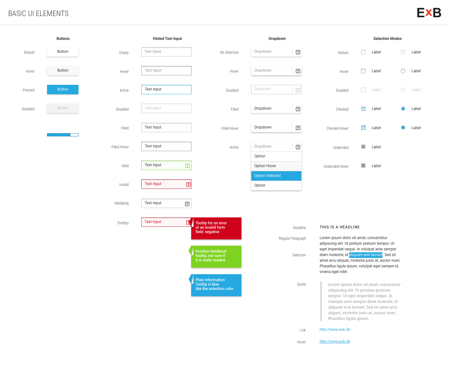
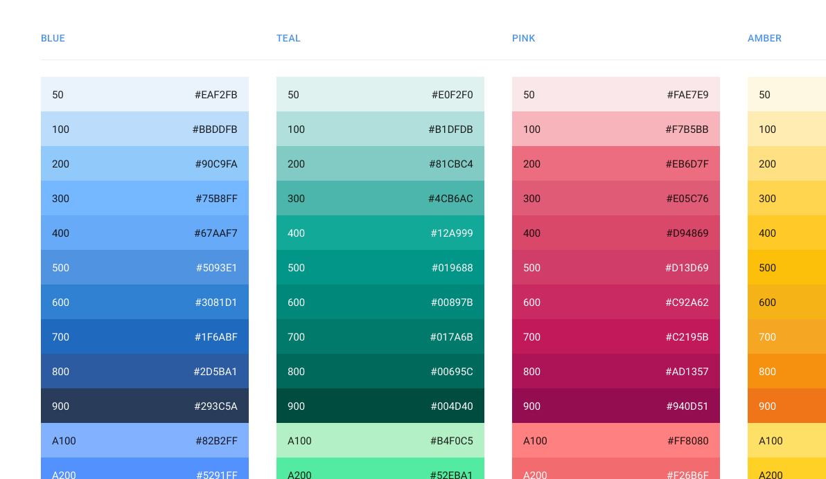
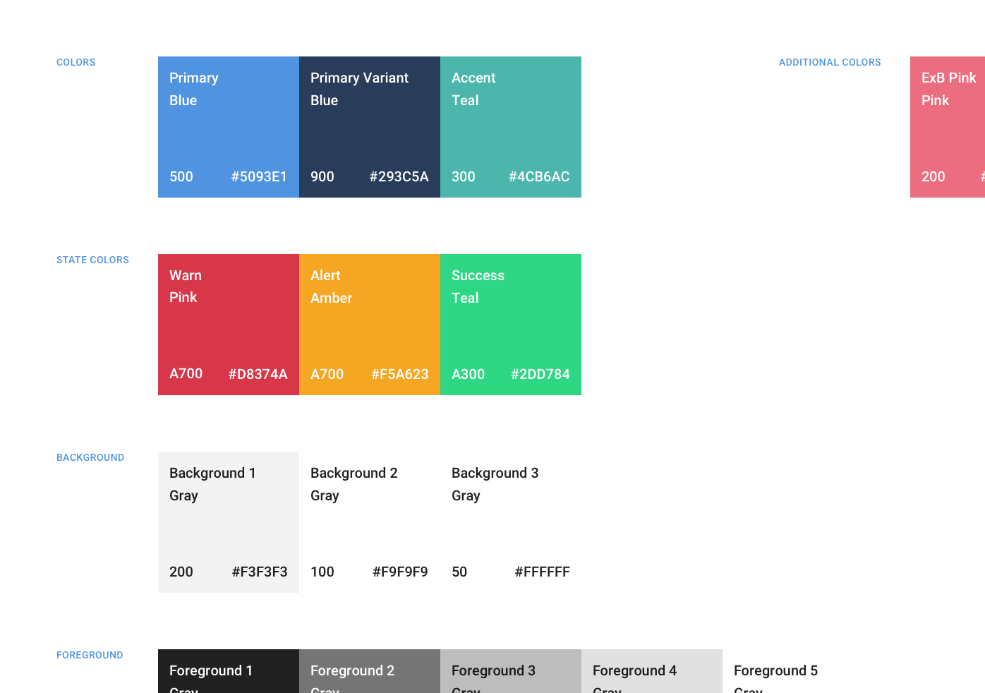
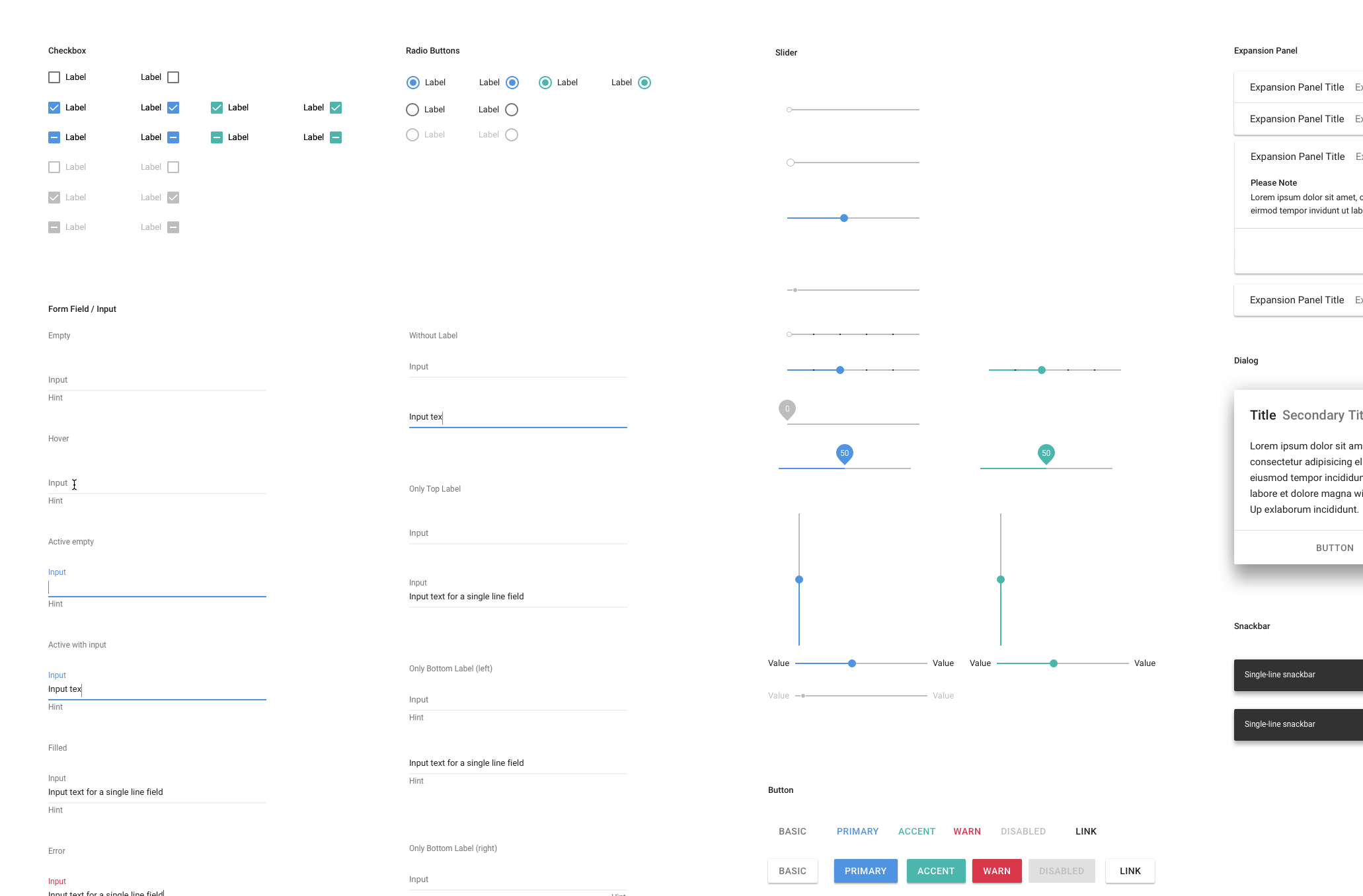
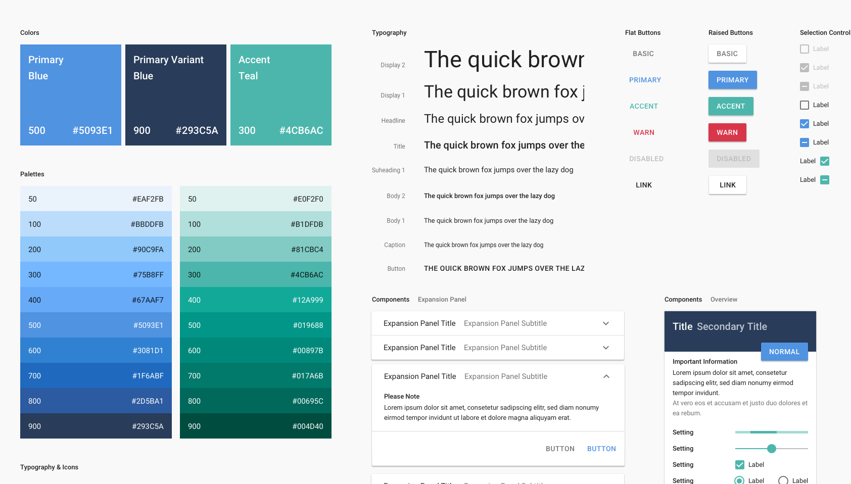
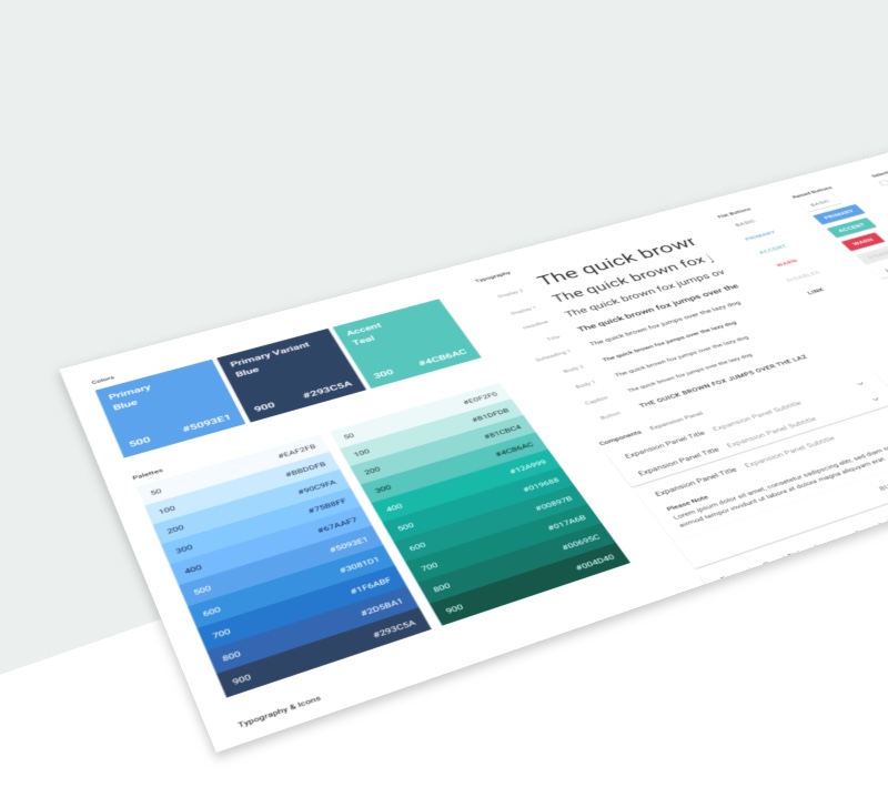
In February 2017, it became clear that our development team would revise the code from ExB's Cognitive Workbench and change it to Angular (Material). We decided to also revise our outdated style guide and introduce a component-based design system.
A well constructed design system can make a big contribution to the success of any major design project. Material design with its guidelines, components and best practices is one of the ways to organize a design system.
I work in a company that mainly employs researchers and developers, but currently not many designers and frontend developers. It was all the more important to rely on a design system because the benefits were obvious:
- saving time for designers and developers
- reduced debate - not necessary to waste time reviewing design decisions for the same component
- reusability of components
- improved collaboration when talking about paper prototypes
